Cozmo App Overhaul
How might we help users discover all of Cozmo’s capabilities through the mobile app?
Background
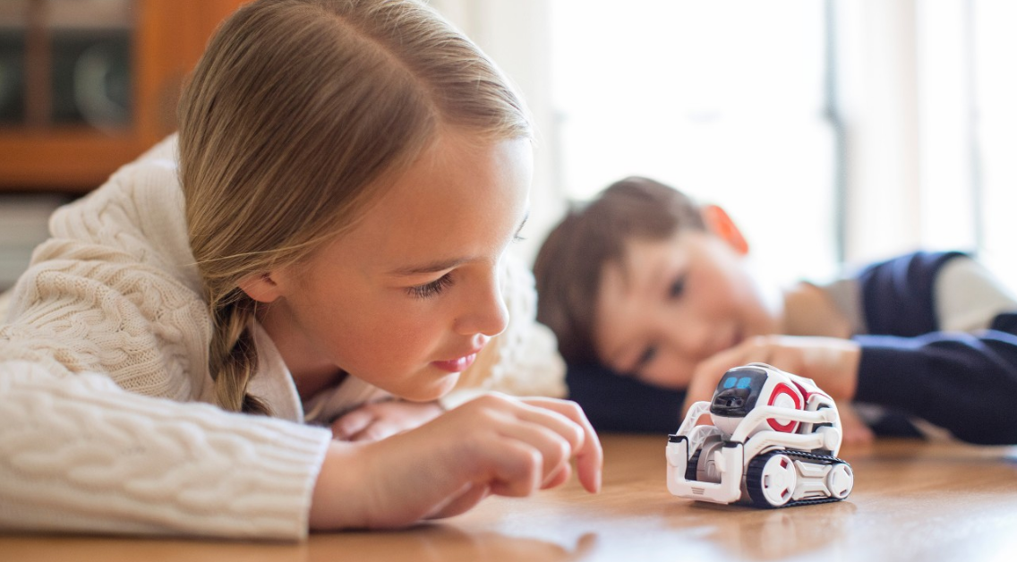
This is Cozmo. He can, among other things:
express emotions charmingly; he celebrates a win and pouts when he loses
autonomously path-plan and amuse himself
play games adversarially against human users
His “brains” live on his accompanying mobile app, and the primary target user is a child between the age of 7 and 12.
I was responsible for all UX design efforts on the Cozmo product line.
Background
The Cozmo team was tasked with an app overhaul to improve customer satisfaction before and during the holiday season, which is when the bulk of sales happen.
Our redesign results:
Amazon product rating increased across all markets. Ratings in Germany, our weakest market, grew from 3.1 to 4.1 out of 5 stars.
During Black Friday week, we sold 40% more units than above forecast, so much so that marketing moved up sales targets. Overall, we sold an extra 50,000 units above the original forecast.
Digging Into the Problem
Discoverability Challenges:
Robot-side, because Cozmo is semi-autonomous, sometimes users had trouble understanding when they had control, when Cozmo had control, what Cozmo was doing at any given moment, and what he wanted them to do.
Based on the home screen, users didn’t feel that there was much content
App-side, users weren’t accessing and engaging with a lot of content because they either didn’t understand how to unlock the content through the game mechanics, or weren’t compelled to.
Design Challenge: Improve Discoverability
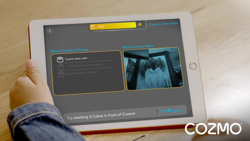
We introduced a “Cozmo’s Free Time” feature to highlight his autonomy
We had a few ideas for discoverability:
Create a new “autonomous” mode where users let Cozmo roam free yet understand exactly what he is doing. Details on the design process are here
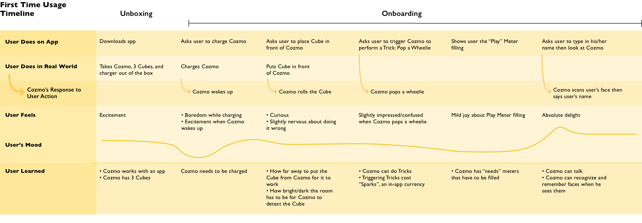
Improve onboarding so users grasp human-robot-Cube interaction, app navigation, and game mechanics
Reinforce onboarding concepts through design on individual pages
Restructure and redesign the home screen so that features are easily accessible in a carousel
Successfully onboarding the user during the very first play session involves teaching the user to use and troubleshoot not only the robot, but the accompanying app, the robot’s Cubes, and the user’s physical environment
Home Screen Explorations
Play-testing Findings
A small sample of kids that played with Cozmo and gave feedback
Over the course of about 2 months’ worth of iterative testing iterations of the app redesign with 40+ kids, we found that:
Kids are very comfortable with scrolling and could find all of the content
Kids felt that there were “so many things to do with Cozmo”
Most kids had an “aha!” moment when they realized Cozmo’s Free Time showed them what Cozmo was seeing, and perceived Cozmo to be more high-tech
Final App Design: Before and After
Home Screen: Before
Home Screen: After
We de-emphasized the meters
Kids were comfortable with carousel navigation
Kids are extremely literal when interpreting visuals, so we used very non-abstract titles and imagery
Games & Tricks: Before
Games: After
We separated Games and Tricks to reduce confusion
We locked Mini Games until users played one of the Main Games, where we provided video instructions on Cube placement, to reduce failure with Cubes
We added the “Play” meter to this view to reinforce that playing games fills the “Play” meter
Feed: Before
Feed: After
Because users were often confused about how vigorously to shake a Cube, we made the hand-holding-Cube illustration in step 2 animate at about the speed that a user was supposed to shake the Cube
We placed a progress bar in step 2
Onboarding: Before
Onboarding: After
Below is an app-walk through of the features that were changed in the app overhaul.
Project Impact & Learnings
After we shipped the app redesign, analytics from the holiday season product usage showed that:
Our Amazon product rating increased across all markets.
During Black Friday week, we sold 40% more units than above forecast. Overall, we sold about 50,000 units above the original forecast.
For the design processes of the 2 major features mentioned earlier, please see: Cozmo Performs and Cozmo’s Free Time.
See the Cozmo Performs project
See the Cozmo’s Free Time project


